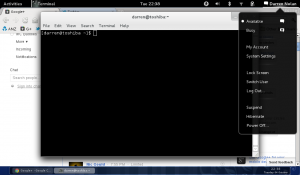
I'm all for progress. But what I question is when workflow of the latest desktop interfaces are seeming to take a turn backwards (MetroUI, OS X, Gnome3, Ubuntu's Unity etc). Like using Windows 3.11 for Workgroups all over again. Where having one opening application is the thing to do, and switching between applications is now more complex then switching a tab in a web browser.
Now we're using things like gestures, swiping movements over the touchpad, mouse hover previews of open apps or new key-combos which simply adds more steps to get to the application you're after or that are already running.
For typical users, I'm sure they don't care. I mean, hey, it looks pretty, and if Apple (and other big names) have learnt anything over the years - it's that pretty sells.
(more…)