Skip to content

Darren Nolan

Computer Tech… and stuff

New Design – Nearly Finished

- Author: - 0 Comment(s)

Just a quick update, it’s nearly ready for everyone to enjoy. Spent a couple hours on the weekend playing with it. Shouldn’t be long now (provided I spend the next hour of my lunch time getting it together!) and should be ready tonight. And that’d be awesome.

^_^

I think all that’s left to really do is get the new Social Links working, as well as the new styles done for the comments section. (And redo my 404 page… Cause that page be awesome!)
Categories: Website

New Site Design!

- Author: - 0 Comment(s)

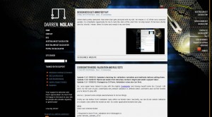
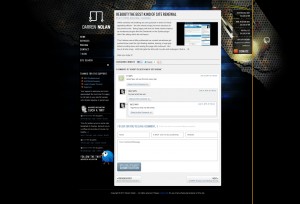
Should have written this a few days ago, but as you’ve no doubt noticed, the Darren Nolan website has gotten a real design now!  One I absolutely love and promise not to change for at least 3 months.

So sporting in this fantastic new theme designed by my ever so talented flat mate Karl Short who works at Always Interactive, is a really cool Page Not Found 404 Error Page – because every personal website requires more black holes, folding sidebar (for viewers of screens less than 960px) and a temporary Mobile version of this site.  Which can be found by going to mobile.darrennolan.com on your handset or down the bottom of every page is a “Switch to Mobile Theme” link.

(more…)

Categories: Website

Insomnia has gotten the best of me

- Author: - 0 Comment(s)

So!  Here’s the site update.  In all it’s broken glory!  I promise to resolve the site issue tomorrow.  This my fellow readers is why it’s important to back wordpress up before switching themes… Wordpress deleted all your data for custom menus or widgets.  Shame on me.

Moving on – it’s time for bed as I’m required tomorrow morning at 9 for work.  Will get it all back and working tomorrow some time.

Cheers,

Categories: Website

REBOOT! The best kind of site renewal.

- Author: - 1 Comment(s)

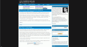
While certainly not breaking any new grounds in terms of visual appealing effects – the site reboot brings just more structure to the previous site.  Being happy with the two fixed columns layout, as wordpress plugins like the Sharaholic or the Syntax plugin didn’t like sitting within the old layout.

This I believe was a little problematic as content sometimes got pushed down past the right floating sidebar, leaving a huge gap before scrolling down and seeing the page still continued.  But now it all sits nicely.  Until Karl gets the shits with my site and redesigns it that is.  =D

Hope you enjoy it 🙂

Categories: Website