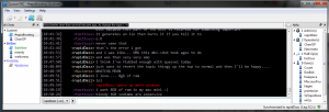
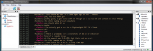
So while I love having a dark theme, I still miss my IRSSI and it’s colors incredibly. Thus work on a new theme is under way. Working from the default style sheet and viewing how Jussi used some of the latest tags to color his theme.
Jussi has a more full version of his theme (which colors more than just the text window) which is yet to be updated in the theme screenshot section on the Quassel website – goto the repo browser for quassel to find the latest version or I might post it here later. These new tags he’s used are awesome but have left me completely confused when editing on mine.
Thus this version of my theme is at the moment, only the text area. With more time I’ll complete the rest of the app’s theme and adjust some of the nick-name colors as well as the action color.

