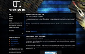
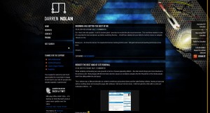
Should have written this a few days ago, but as you’ve no doubt noticed, the Darren Nolan website has gotten a real design now! One I absolutely love and promise not to change for at least 3 months.
So sporting in this fantastic new theme designed by my ever so talented flat mate Karl Short who works at Always Interactive, is a really cool Page Not Found 404 Error Page – because every personal website requires more black holes, folding sidebar (for viewers of screens less than 960px) and a temporary Mobile version of this site. Which can be found by going to mobile.darrennolan.com on your handset or down the bottom of every page is a “Switch to Mobile Theme” link.
There was a couple of challenges when taking Karl’s designed Photoshop document into HTML/CSS which was mainly little things like the bar beside every article document. Basically the header tag has bottom border colour and I cheated (after many failed attempts at work-arounds) by giving the actual link a black underline and moving it over the top of the border.
There was some concerns with the floating right hand menu (position: fixed) which continued to collapse in most browsers when the window was smaller than about 1200px which was resolved by making it hidden by default, shown when the user has java, and then re-hidden when the window is too small. As it is now, when the window is too small or javascript is not enabled, you’ll see those links in the left hand side bar. Which in my bias personal opinion, is a fantastic solution.
The pages on the left will continue to be fixed up (Services and Pricing) when I have some more free time, unless I find a fantastic company to sell my soul to on a permanent basis. At present they’re simply blank.
And as always, I cherish HTML5/CSS3 technologies and as such use them on my site. As this is my personal site, I’m really not phased if you have troubles viewing it in Internet Explorer 6 (which works fine as a side-note, provided you have JavaScript enabled).
I do have full intentions for the GST Calculator lovers (all 8,000+ 4,500+ (9,000+ views) of you that visit every month) to make the form a little easier to use now that we’ve switched from a white/light theme to a black/dark theme.
Again, all in due time when I become available to myself.
So – I hope you love the new design – leave some comments and feedback or a simple “I LOVE YOUR WORK” message, I always get a smile from those – even if I don’t get a chance to reply back to your message – know that I’ve read and appreciate your kind words.
I still have a couple of posts I’m ever so slowly working on, namely SEO – which I still continue to recieve emails about. I will make that post, it’s always just a matter of timing in my day.

